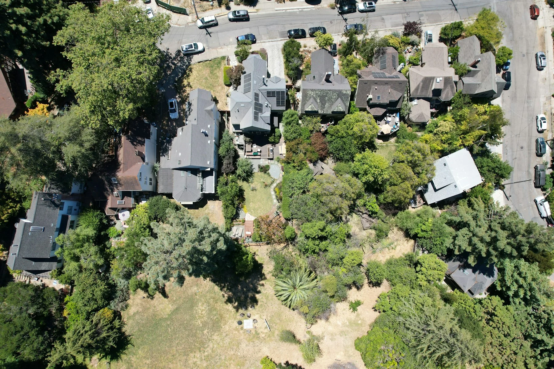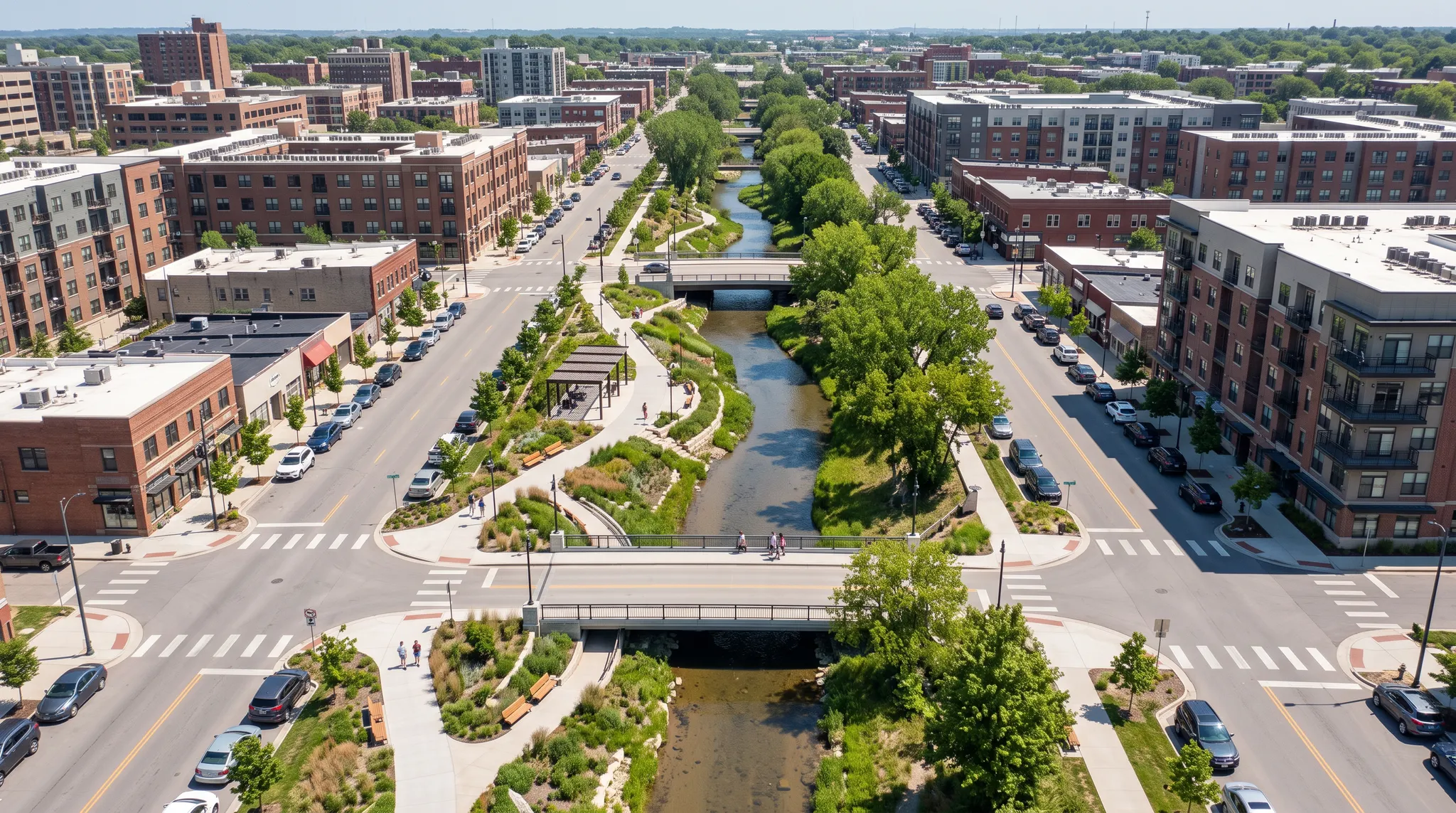
Community engagement on a park project works differently from a comprehensive plan, because nearly every useful answer is a location. Which crossing feels unsafe. Which path people take when the marked one is longer. Which corner nobody sits in after four o'clock. A flat survey collects opinions about a park; a map-based survey collects them about places inside it, and only the second kind can be designed from.
What follows is the workflow end to end, worked through a downtown park refresh that Design Collective ran in Frederick, Maryland between February and April 2026: the Carroll Creek Park public space and hardscape scope, delivered with the City of Frederick, the Downtown Frederick Partnership and the Ausherman Family Foundation.
Start with the site, not the survey
Park projects sit at a scale most engagement tools handle badly. A corridor study covers nine counties; a park refresh covers four blocks of creek frontage, and the difference between two benches is a difference the community has opinions about. Set the study area on the actual site boundary and let the base map switch to aerial at close zoom, because a participant identifying a specific bench needs to see the bench, not a road network.
Do this before you write a single question. The map is the instrument, and the questions hang off it.
Show the design, don't describe it
The visual preference survey has existed in landscape practice for decades in a physical form: print the concept boards, set them on easels, staff the room, hand out sticky dots, then count the dots by hand afterwards and type up the result. It works. It also costs a room, an evening, printing, and a person's time on both ends, and it reaches whoever could be in that room on that Tuesday.
The digital version puts the same boards in front of a phone. On Carroll Creek that meant image comparisons for shade structure options and image selections for the planting palette (boxwood, hydrangeas, redtwig dogwood, inkberry, winterberry), with conditional logic sending people down different branches depending on what they picked. Thirty-five questions in total, mixing map questions, ratings, star scales, open text and image choice.
Senf can scaffold the project and survey from an RFP in minutes. With an image-heavy park survey, the work is choosing the right concept images and refining the questions—not configuring the platform. Plan time for that content review, then reuse the structure on the next project.
The completion figures are the argument for doing it anyway. Of 2,201 residents who started, 1,436 finished: a 65.2% completion rate at an average of 10 minutes 32 seconds.
If we would have tried to do this survey with SurveyMonkey, 35 questions, I don't know that we would have gotten this level of participation.
Ask where, not only what
Three question types carry most park projects. Pins mark points: a broken light, a favorite spot, a place that feels unsafe. Drawn routes capture movement, which matters when the desire line and the paved path disagree. Marked areas define zones, such as the part of the lawn that floods or the stretch that needs shade.
Carroll Creek's most useful finding came out of the pins. The heaviest concentration of comments landed on the vehicular-pedestrian crossings, and the comments underneath them were specific: crossing intervals too short for people with mobility difficulties, garage crossings with no markings, curb cuts that could not be used. None of that was a question the survey asked. It came from where people chose to put their pins.
Just by moving across the result maps, you could immediately see where most comments clustered.
That is the part worth planning for. A pin map is a diagnostic instrument as much as a data collection one; read the clustering before you read the categories.
Run the in-person day into the same dataset
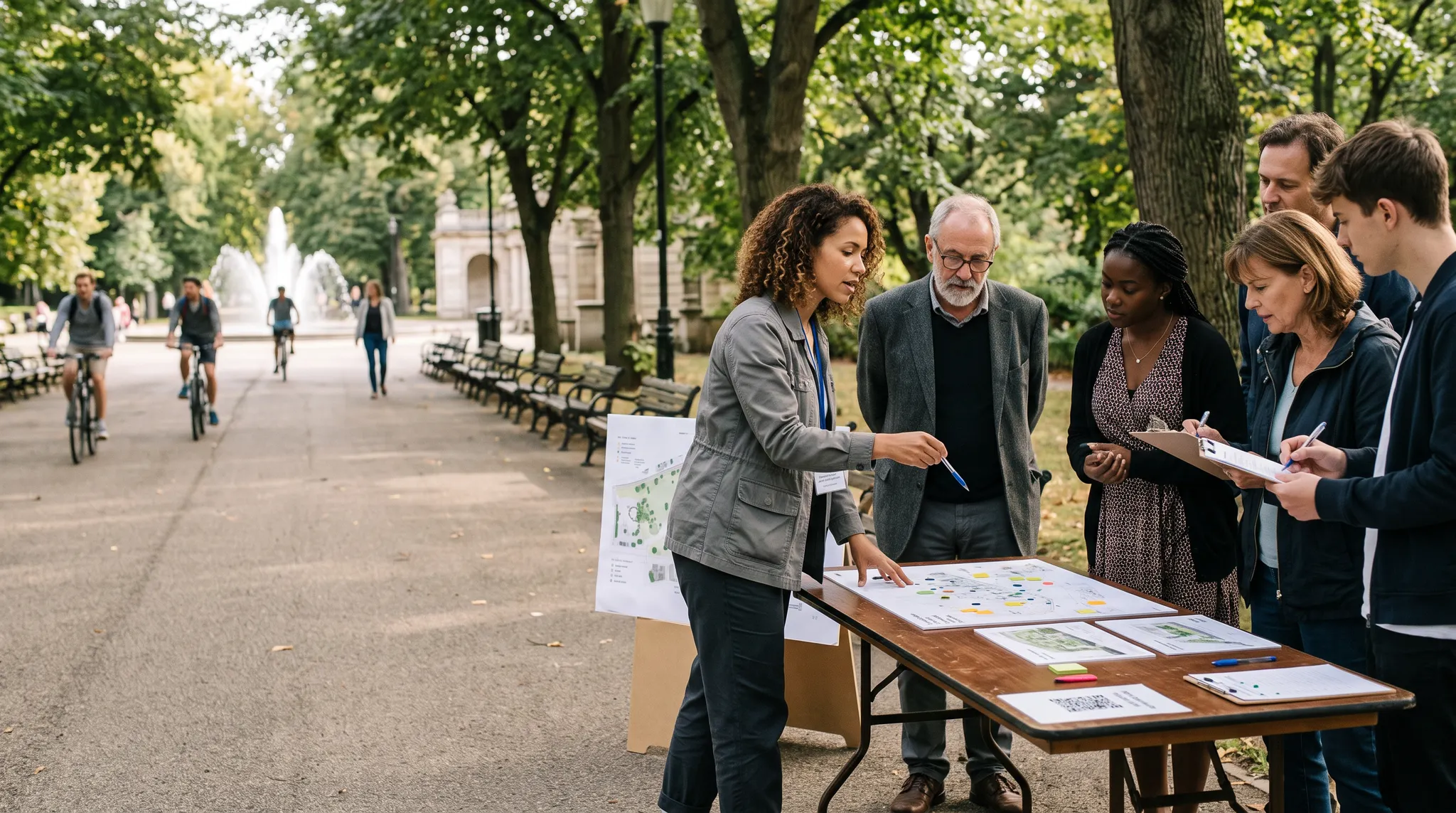
Park engagement happens in the park. A Saturday table by the fountain reaches people a project website never will, and that day should feed the same dataset as everything else rather than becoming a second pile of paper.
Two mechanisms handle it. A QR code on the signage, the table and the flyer takes people straight into the survey on their own phone, and participation by channel stays visible. For people who would rather not, the survey exports as a PDF for paper collection, and those responses go back into the platform afterwards. The counting step disappears; the sticky dots do not have to.
Watch who is answering while the survey is open
A live results dashboard earns its place on a park project by showing you a gap while there is still time to close it.
Carroll Creek reached well beyond the immediate neighborhood: 39.1% of participants were city residents from outside the downtown boundary, 25.3% came from elsewhere in Frederick County, and 24.5% were business owners, workers or volunteers downtown, against 19.1% downtown residents. Turnout held across every age band, including more than 140 respondents over 75.
That speaks to the simplicity of the interface for people to easily participate.
Check the demographic split in week one and week three, not at the close. If a group is missing, the fix is an outreach change (a different venue, a different language, a printed round), and it only works while the survey is still collecting.
The output is two slides and two pages
Ask a landscape practice what reporting they need and most will say a report. Push once and the honest answer is usually narrower: one or two summary slides to drop into the deck for the council presentation, and one or two engagement pages inside the final implementation document. Almost nobody produces a standalone engagement report that anyone reads.
Scope for those two artifacts. Export the charts you need, write the two pages around the clustering finding rather than around response counts, and put the interesting map image in the deck. A heat map of where the comments landed argues better in a public meeting than a bar chart of how many arrived.
What this doesn't solve
A digital survey does not replace the Saturday table, and no serious practice should sell it that way. Physical presence surfaces the conversation nobody writes down.
There is no fully offline mode; the PDF route covers in-person collection but assumes you can get the responses back to a connected machine. Before-and-after image sliders, which come up constantly in park work, are not available yet; two consecutive slides do the job less elegantly. And automated categorization of open text gets the obvious themes right while mishandling comments that belong in two categories at once, so the first pass on a park project deserves a manual read before anything goes to a client.
FAQ
Frequently asked questions
It covers spatial analysis. Survey123 is built for staff and field crews, and anything non-standard tends to end in XML. The gap is the public end: a resident with a phone and no GIS background needs to be able to place a pin correctly on the first try. Collect there, then sync to ArcGIS Online or export as GeoJSON or Shapefile so the analysis happens where it already happens.
Senf can scaffold the project and survey from an RFP in minutes. For an image-heavy park survey, most of the remaining time goes into selecting the right concept images and refining the questions—not configuring the platform. Reusing the structure as standard templates on the next project makes that content work faster too.
Yes, and route drawing matters more there than pins. Multi-location and network projects work the same way; the study area is drawn or uploaded as a shapefile.
Print the survey as a PDF for the in-person day and upload the responses afterwards. They join the same dataset and appear in the same charts.
Charts and maps export directly for a deck or a report. Direct client access to a live dashboard is a conversation worth having with us project by project.
Build a park project from your next RFP
If you have a parks or public space RFP in front of you, the fastest way to judge any of this is to build the project from it and look at the result. Here is how that works →
Senf is the community engagement platform built for private-sector planning, design, and engineering consultancies.
Related: Carroll Creek Park, Frederick MD — the full case study · Senf for landscape architecture · Map-based engagement · What to look for in a community engagement platform