How to run a digital community engagement process
A step-by-step guide for planners: the five stages, the IAP2 levels, and how automation compresses the busywork

Running community engagement used to mean church-hall meetings, paper comment cards, and weeks of manually typing responses into a spreadsheet. Today, most of that process happens online — and the planners who run it well spend less time on logistics and more time on what actually matters: turning resident input into better plans.
But “doing it digitally” isn’t a single tool or a one-off survey. It’s a process with distinct stages, each with its own goal and its own promise to the public. This guide walks through that process step by step, grounded in the frameworks U.S. planners already use, so you can design engagement that produces defensible results without drowning your team in busywork.
What is digital community engagement?
Digital community engagement is the practice of involving residents, stakeholders, and the public in planning and decision-making through online tools — such as interactive maps, surveys, and project webpages — alongside or instead of in-person methods.
It’s the same discipline of public participation that planners have always practiced. What changes is the channel: instead of relying solely on meetings limited by time, location, and who can show up, digital methods let people contribute when and where it works for them. The result is usually broader reach, richer data, and a clearer paper trail of how input shaped the outcome.
Digital engagement doesn’t replace face-to-face conversation — the strongest processes blend both. But for collecting input at scale, visualizing it on a map, and documenting it for the record, online tools do in hours what manual methods do in weeks.
Choosing your level of participation: the IAP2 Spectrum
Before you choose any tool, decide how much influence the public will actually have over the decision. Promising more than you can deliver is the fastest way to erode trust.
The IAP2 Spectrum of Public Participation — developed by the International Association for Public Participation and referenced by the U.S. EPA as a standard — defines five levels, from least to most public influence:
- Inform — Provide balanced information. Promise: “We will keep you informed.”
- Consult — Gather feedback on analysis or alternatives. Promise: “We will listen and acknowledge.”
- Involve — Work directly with the public so concerns are understood and considered. Promise: “We will reflect your input in the alternatives.”
- Collaborate — Partner with the public on each aspect of the decision. Promise: “We will incorporate your advice to the maximum extent possible.”
- Empower — Place final decision-making in the public’s hands (e.g., participatory budgeting).
These are levels, not steps — a common misreading is to think a project moves up the spectrum over time. You pick the level that fits the decision, the timeline, and your client’s appetite for sharing influence. Most planning projects sit at Consult or Involve. Naming your level up front tells you which digital methods you need and what you’re promising participants.
The digital community engagement process, step by step
A complete process moves through five stages. Each maps to a different stage of the planning timeline.
Step 1 — Plan and set up
Start with the decision you’re trying to inform, not the tool. Define:
- The decision the engagement supports, and which planning phase it falls in
- Your IAP2 level and the corresponding promise to the public
- The audience you need to reach — and, critically, who you tend to miss (renters, non-English speakers, younger residents, shift workers)
- The questions that produce data you’ll actually use in the next planning phase
This is also where you build your project’s digital home: a clear, plain-language project webpage that explains what’s happening, why, and how people can weigh in. Treat plain language as a participation lever, not a courtesy — every undefined acronym and every link to a 200-page draft is a point where someone decides not to bother. Write the page for a resident who has thirty seconds and no planning background.
Step 2 — Inform
This is the foundation. Before you can ask for meaningful input, people need to understand the project: what’s proposed, what’s at stake, and how their voice fits in.
Effective informing in a digital process means:
- A project page as the single source of truth, updated as the project evolves
- Visual materials — maps, renderings, scenarios — not walls of text
- A clear timeline so people know when and how they can participate
Informing isn’t a one-time announcement. It runs the length of the project and sets the tone for everything that follows.
Step 3 — Collect input
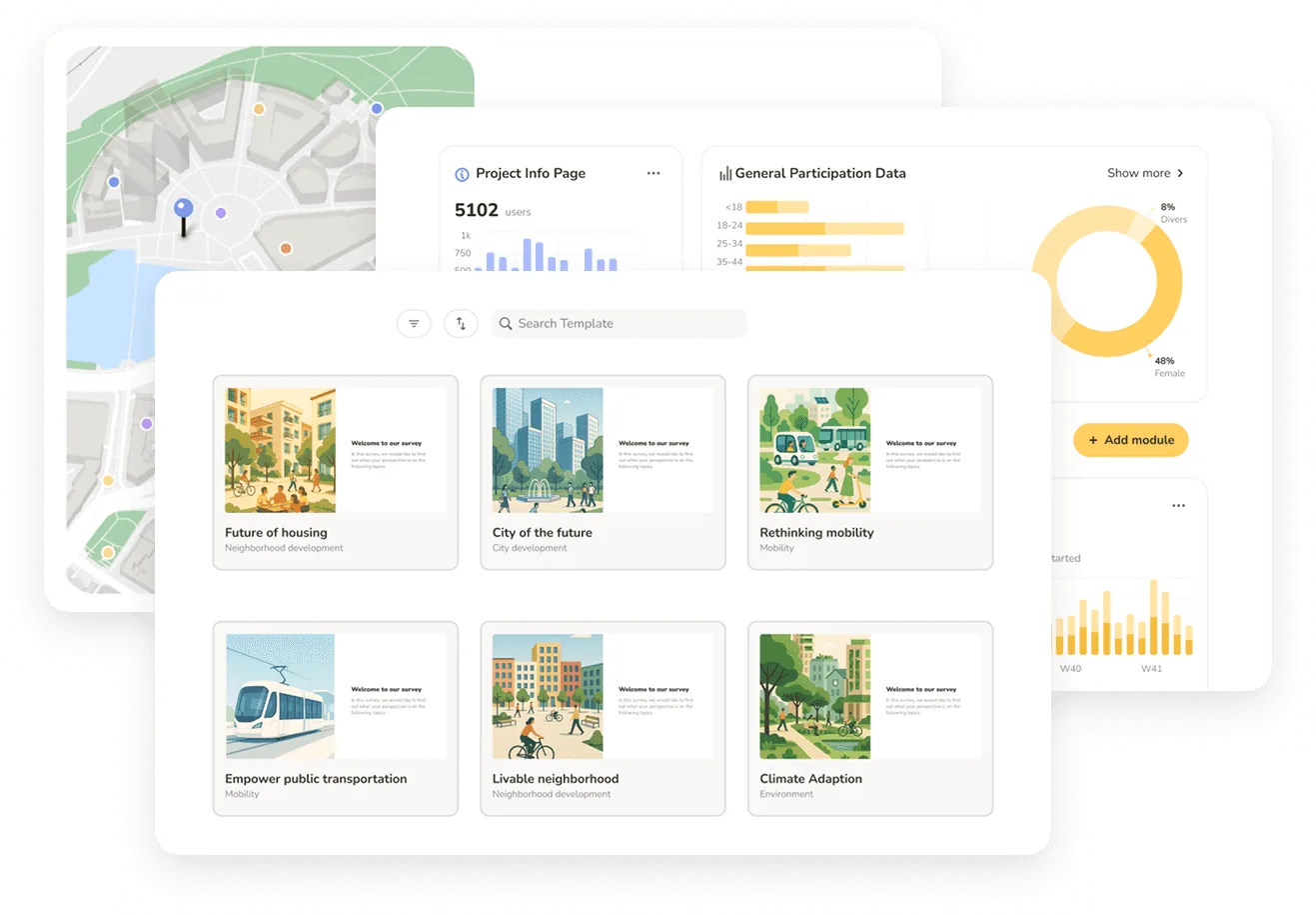
This is the stage most people picture when they think “engagement,” and it’s where digital methods earn their keep. The strongest tools for planning are map-based, because so much resident knowledge is inherently spatial: this intersection feels unsafe, that lot should be a park, this route is how I actually walk to school.
Common digital collection methods include:
- Map-based surveys — let residents drop pins, draw routes, and comment on specific locations
- Standard surveys — for demographics, priorities, and structured questions
- Interactive project pages — where people react to proposals, vote on alternatives, and rank options
- Hybrid formats — QR codes at pop-up booths and in-person events that feed the same digital dataset
The goal is to make contributing genuinely easy — mobile-friendly, accessible, and short enough that people finish.
Step 4 — Analyze
Here’s where traditional engagement quietly breaks down. A successful campaign can generate hundreds or thousands of responses — and then someone on the team spends days reading, coding, and summarizing them by hand. The analysis often lands after the planning decision it was supposed to inform.
A well-run digital process treats analysis as part of the workflow, not an afterthought:
- Quantitative data (ratings, demographics, votes) visualized automatically
- Spatial data mapped as heatmaps and clusters to reveal where concerns concentrate
- Open-text responses summarized into themes — where automated, AI-assisted summarization can compress days of manual coding into minutes
One non-negotiable principle: every insight has to trace back to the source data. A summary you can’t defend in a public meeting is worse than no summary at all. Good tools let you click from a theme straight to the individual comments behind it.
Step 5 — Report back and close the loop
This is the step most processes skip — and the one that builds or destroys trust. People participate again when they see their input was used. They disengage permanently when their comments vanish into a void.
Closing the loop means producing a clear, shareable account of:
- What you heard — the headline findings, by theme and by area
- How input was used — which ideas shaped the plan, and, just as importantly, which couldn’t be incorporated and why
For U.S. planners, a documented “How Input Was Used” record isn’t just good practice — it’s tied to compliance. Processes under NEPA and Title VI require demonstrating meaningful public involvement, and a transparent record of who participated and how their input was addressed is exactly what stands up to review.
The friction here is real: assembling that report manually in PowerPoint or Word, every time, is a significant chunk of project hours. This is the part of the process most ripe for automation — turning a configured set of results directly into a client-ready report and a public-facing summary from the same source data.
What a “How Input Was Used” report actually contains
Most guidance tells you to close the loop but never shows what the artifact looks like. Here’s the anatomy of a report-back that survives a public meeting and a compliance review:
- Participation summary — how many people took part, through which channels, and across which neighborhoods or demographics. This is your Title VI evidence: it shows you reached, and heard from, a representative cross-section.
- What we heard, by theme — the recurring concerns and ideas, ranked by frequency, each traceable to the underlying comments. Themes without source data are opinions; themes with it are findings.
- What we heard, by place — for spatial input, a map showing where concerns concentrate. A heatmap of “unsafe crossing” pins makes a case no paragraph can.
- How each theme was addressed — the honest part. Which input shaped the plan, which couldn’t be incorporated, and the reasoning for both. Residents forgive a “no” with a reason; they don’t forgive silence.
- What happens next — the decision timeline and the next chance to participate, so the loop stays open.
The discipline that ties all of this together is traceability: every number, theme, and quote in the report should link back to the raw input behind it. That’s what lets you defend a finding when a council member challenges it — and it’s the difference between a report that builds trust and one that invites suspicion.
The catch is that assembling this by hand, project after project, is where planning hours quietly disappear. A configured results layout that generates both the public summary and the client report from the same source data turns a multi-day task into a review-and-publish step.
Common pitfalls (and how to avoid them)
- Asking before informing. If people don’t understand the project, their input is noise. Sequence matters.
- Over-promising influence. Naming the wrong IAP2 level sets expectations you can’t meet.
- Only reaching the usual suspects. Self-selection skews toward those already engaged. Plan proactively for who you’ll otherwise miss.
- Treating analysis as cleanup. If results land after the decision, the engagement was theater.
- Never closing the loop. No report-back means no trust, and lower participation next time.
How automation is reshaping the process
The five stages above haven’t changed in decades. What’s changing fast is how much of the manual labor between them can be automated.
The bottleneck for most planning firms was never collecting input — it was everything around it: building the project page, structuring the survey, cleaning and coding responses, and assembling the final report for the municipal client. Each of those steps, done by hand, eats hours that don’t add planning value.
Modern platforms increasingly automate the connective tissue: scaffolding a project from a brief, summarizing open responses with traceable AI, and generating both a live results view and a downloadable report from a single configured layout. The payoff isn’t fewer steps in the process — it’s the same rigorous process delivered in a fraction of the time, which is what lets a small firm run more projects without growing the team.
Senf is built around exactly this: automation along every step of the engagement process — from project setup to analysis to a client-ready report — so planning firms spend their hours on judgment, not assembly.
FAQ
Frequently asked questions
See Senf in action
• Walk through a full engagement process end to end
• See project setup, map-based input, native AI analysis, and reporting
• Discuss pricing based on your project volume
See Senf in action
• Walk through a full engagement process end to end
• See project setup, map-based input, native AI analysis, and reporting
• Discuss pricing based on your project volume
See Senf in action
• Walk through a full engagement process end to end
• See project setup, map-based input, native AI analysis, and reporting
• Discuss pricing based on your project volume