Accessibility in community engagement: a planner’s guide to the new ADA rules
What the DOJ’s Title II rule requires, why it matters, and how to make map-based engagement accessible

Accessibility used to sit at the bottom of the engagement checklist, the thing you got to if there was time. That era is over. A federal rule now puts a hard deadline and a real legal liability on the accessibility of the digital tools planners use to engage the public. If you run community engagement for a city, county, or any public entity, the surveys, project pages, and interactive maps you deploy are now squarely inside the scope of the Americans with Disabilities Act.
This guide explains what changed, why it matters beyond compliance, what the standard actually requires, and where the hardest problem lies: making spatial, map-based engagement accessible. It closes with a practical checklist you can apply to your next project.
What changed: the DOJ’s Title II web accessibility rule
On April 24, 2024, the U.S. Department of Justice published a final rule under Title II of the ADA that sets a specific technical standard for the digital content and services of state and local governments. That standard is WCAG 2.1, Level AA, the Web Content Accessibility Guidelines developed by the World Wide Web Consortium. Before this rule, public entities had a general obligation not to discriminate. Now they have a measurable bar to hit.
The compliance dates were extended in April 2026 through an interim final rule, but the substance did not change. The current deadlines are:
- April 26, 2027 for public entities with a population of 50,000 or more
- April 26, 2028 for public entities under 50,000 and for special district governments
Two points matter most for planners.
First, the rule reaches vendors and third-party tools. It applies to web content and apps a government “provides or makes available,” including through an arrangement with someone else. In plain terms: if a city makes your engagement platform available to residents, that platform falls under the city’s obligation, even if a consultant set it up and a private company runs it. Accessibility is now a procurement question and, increasingly, a tender criterion.
Second, responsibility lands on the planner. The American Planning Association put it directly in 2026: planners who procure, develop, or manage project websites, mapping tools, public-comment systems, or survey tools are responsible for ensuring those tools meet WCAG standards. You cannot outsource the obligation by picking a vendor and looking away.
One clarification worth keeping straight, because the obligation depends on who your client is. Federal agencies follow Section 508. State and local governments fall under ADA Title II, which is the rule covered here. Private organizations may face Title III obligations depending on their size and how public-facing their services are. Different door, same destination: WCAG conformance. If you work across client types, build the requirement into every project scope from the start rather than discovering it mid-contract.
Why accessibility matters beyond the deadline
Compliance is the floor, not the reason. About one in four U.S. adults lives with a disability. An engagement process that a screen-reader user cannot complete, or that a keyboard-only user gets trapped in, is not gathering representative input. It is systematically excluding a quarter of the public and then reporting the result as the community’s voice.
That cuts to the core of what engagement is for. The entire premise of public participation is hearing from a representative cross-section, especially the people most often left out. This is the idea behind human-centered design, or “design for all”: you design for the full range of people who will actually use the thing, not an imagined average user. Inaccessible tools quietly reintroduce the exact bias the process exists to correct. When a resident cannot read the staff report for a rezoning, or cannot leave a comment on a proposed bike lane, that is not a technical bug. It is a participation failure that shows up later as a challenged decision and eroded trust.
What WCAG 2.1 Level AA actually requires
WCAG 2.1 AA is a set of around 50 success criteria. You do not need to memorize them, but you should recognize the ones that surface constantly in engagement tools:
- Keyboard operability. Every function works without a mouse, and the user never gets stuck (no “keyboard traps”). A visible focus indicator shows where they are.
- Text alternatives. Images, icons, buttons, and other non-text content carry meaningful alt text that describes their purpose, not just their existence.
- Captions and transcripts for video and audio, which matter for the explainer videos and recorded meetings common in engagement.
- Color contrast. Text and meaningful graphics meet minimum contrast ratios, and information is never conveyed by color alone.
- Labeled, navigable forms. Survey fields have properly connected labels, and error messages are announced to assistive technology.
- Logical structure. Tagged headings and a sensible reading order so screen readers can move through content predictably.
A warning that saves heartbreak later: automated scanners catch only a fraction of these issues, commonly cited between a quarter and 40 percent. They can flag a missing alt attribute but cannot judge whether the alt text is meaningful. Real conformance requires manual testing with a keyboard and a screen reader, and ideally testing with people who actually use assistive technology. Accessibility overlay widgets, the one-line scripts that promise instant compliance, do not fix the underlying code and have repeatedly failed to hold up in court.
The hard part: accessible maps and spatial input
Here is the uncomfortable truth at the center of digital engagement. Map-based participation, dropping a pin, drawing a route, commenting on a location, is the most valuable input planners collect, because so much resident knowledge is inherently spatial. It is also the least accessible part of the entire toolkit.
Maps communicate through a visual medium by nature, which excludes users with low or no vision unless the information is also made available another way. Research evaluating digital map tools against WCAG has found most of them fall short: to a screen reader, a typical interactive map announces little more than “map region, clickable,” conveying none of the actual spatial information. Studies reviewing common map frameworks have concluded that few meet WCAG 2.1 criteria out of the box.
This does not mean abandoning maps. It means never letting the map be the only way to participate, and designing the map itself with care. Practical approaches:
- Provide a non-graphical equivalent. Pair every map with a list or table view that conveys the same information and lets people contribute the same input through text.
- Make controls keyboard-operable and labeled. Users must be able to pan, zoom, select a location, and submit without a mouse, with clear focus states. Label controls with text, not icons alone, and give people a clear way to reset to the default view.
- Never rely on color alone to distinguish areas, categories, or status. Add borders or outlines between adjacent regions, pair color with patterns or labels, and use colorblind-safe palettes (Viridis, ColorBrewer, and similar). Check the map in grayscale to confirm it still reads.
- Give the map a meaningful text alternative that describes its purpose and content, not just “map,” and keep the geographic scope, scale, and units clear on the page.
- Offer an alternate input route. If someone cannot drop a pin, let them name a location, choose from a list, or describe it in text, and capture that into the same dataset.
Treat spatial accessibility as the frontier it is. A planning firm that solves it has both a compliance answer and a genuine differentiator, because most tools still have not.
A practical accessibility checklist for your next project
Build accessibility into the engagement plan from the start rather than auditing at the end:
- Set the standard in writing. State that the project’s digital content and tools will conform to WCAG 2.1 Level AA.
- Vet your tools before you commit. Ask every vendor for an accessibility conformance report (a VPAT) and for documentation of keyboard and screen-reader support. “We’re accessible” is not documentation.
- Provide non-visual equivalents for every map and chart, and offer alternative formats (a data table, a PDF, a phone number) for people who need them.
- Write in plain language. Accessibility includes cognitive access: short sentences, no unexplained jargon, and a reading level a general audience can follow (an eighth-grade level is a common target). Make link text descriptive, “view the full report” rather than “click here.”
- Offer multiple languages. Language access is a related civil-rights obligation under Title VI, and automatic translation now makes it feasible at scale.
- Design for mobile and keyboard. Touch targets large enough to tap reliably, a layout that holds up on small screens, logical tab order, visible focus indicators, and skip-navigation links for screen-reader users.
- Keep an offline route. Pair every online method with an in-person or paper option so the digital divide does not become a participation divide.
- Test with a keyboard and a screen reader, not just an automated scanner.
- Publish an accessibility statement with a way for residents to flag barriers and request help.
Common mistakes to avoid
- Trusting automated scans alone. They miss most issues. Manual and assistive-technology testing is required.
- Buying an overlay widget. It does not fix the underlying problem and may add new barriers.
- Assuming the vendor handles it. The legal responsibility sits with the public entity and, in practice, with the planner who chose the tool.
- Treating the map as the whole interface. If the map is the only path, the experience is not accessible.
- Leaving accessibility to the end. Retrofitting is expensive and incomplete. Designing it in is neither.
What the platform carries, and what stays with you
The list above is long, and most of it is genuinely hard. It helps to separate it into two layers, because they sit in very different places.
The platform layer is the technical foundation: keyboard operability, screen-reader support, focus management, color-contrast systems, responsive touch targets, accessible form wiring, and the hardest piece of all, a map that a keyboard and a screen reader can actually use. This is real engineering, it is where most tools fall short, and it is not something a planner can fix on a per-project basis. The right move here is to choose a platform that is built to the standard and tested with assistive-technology users, then verify it with a conformance report. Once the tool is right, this layer is handled for every project you run on it.
The content layer is your material: the words you write, the images and PDFs you upload, the videos you attach. Historically this was all manual work. Increasingly, good platforms automate much of it too, drafting alt text for images, flagging reading level, simplifying language, and translating into other languages. That shifts your job from creating each piece by hand to reviewing what the tool produced, because automated and AI-generated output still needs a person to confirm it is accurate and says what you mean. That review is what stays with you, and it is far lighter than doing it all from scratch.
Between a platform that carries the technical layer and automates much of the content layer, what is left for you is judgment and review, not construction. That is what makes an accessible process realistic on a normal timeline.
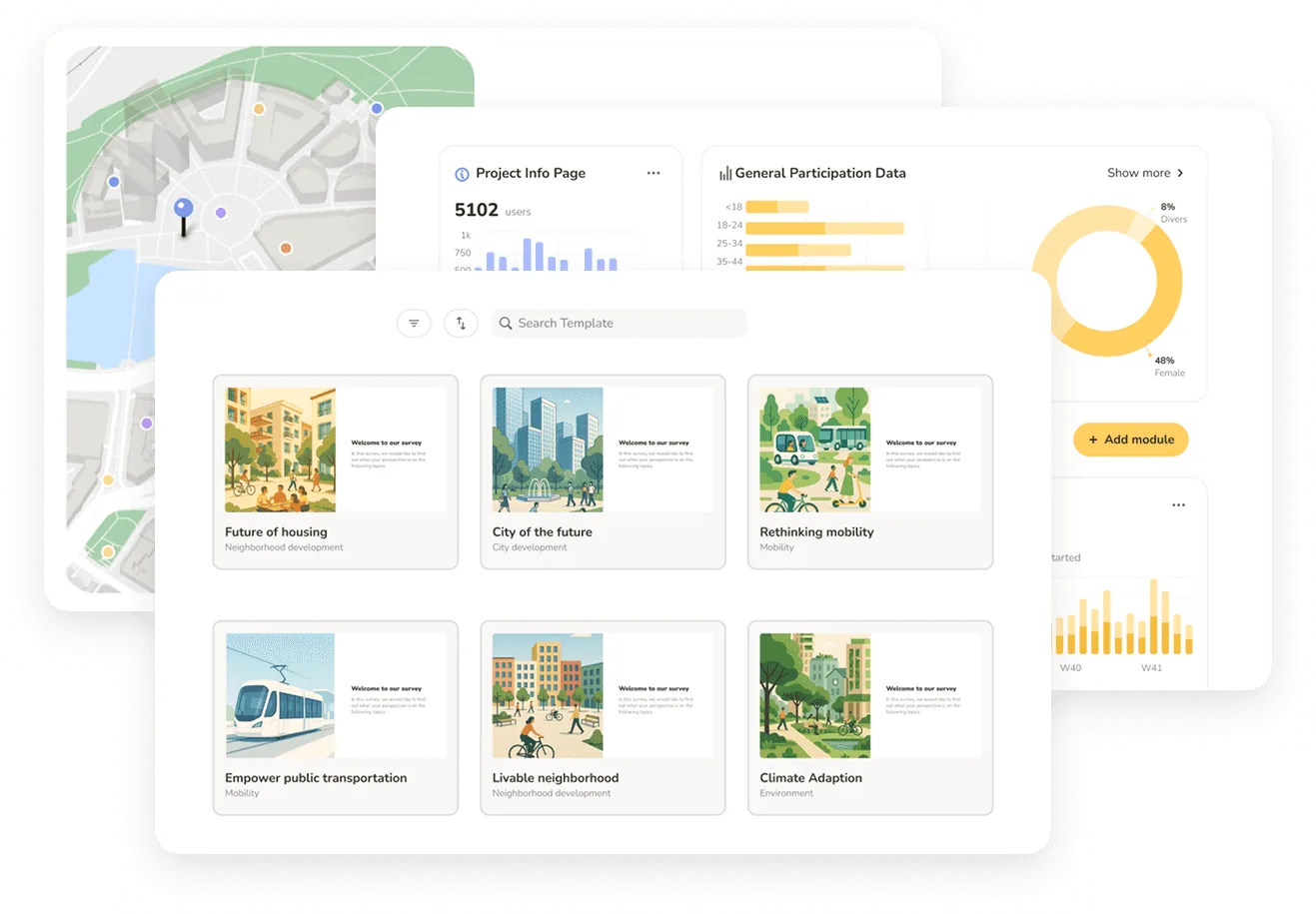
Senf is built to meet WCAG 2.1 Level AA across the platform, including the map. Pin-drop and route input are operable by keyboard and compatible with screen readers, every map is paired with a list and table view, and we test with people who use assistive technology. That means the technical layer, the hard part most tools leave to you, is handled for every project. Senf also automates much of the content work, drafting alt text, supporting plain language, and translating, so what is left for your team is review rather than creation. Together, that makes running an accessible process realistic on a normal timeline.
This article is general information, not legal advice. Confirm your obligations and deadlines against the current DOJ rule and consult counsel for your specific situation.
FAQ
Frequently asked questions
See Senf in action
• See keyboard- and screen-reader-operable map input
• Walk through WCAG 2.1 AA support, list/table views, and AI-assisted alt text
• Discuss pricing based on your project volume
See Senf in action
• See keyboard- and screen-reader-operable map input
• Walk through WCAG 2.1 AA support, list/table views, and AI-assisted alt text
• Discuss pricing based on your project volume
See Senf in action
• See keyboard- and screen-reader-operable map input
• Walk through WCAG 2.1 AA support, list/table views, and AI-assisted alt text
• Discuss pricing based on your project volume